So American Girl is releasing a new historical girl from the 1920s! Woo, I love that mainly because I love the 20s so it’ll be good for kids to have a new, admittedly more entertaining way to learn about the Harlem Renissance rather than just school books and lectures.
However, I do have one cavet concerning the artwork.
Now take my words with a grain of salt since I generally don’t like the whole 2016 Beforever update or whatever they’re calling it now. It looks too polished to me but this feels particularly eh.
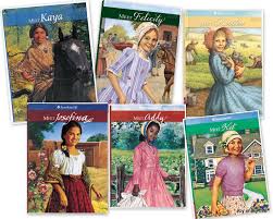
I mean with the 1997 and other versions, there was so much historical detail in the illustration with the outfits and the background, like you could see the texture and movement in their clothes.
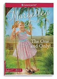
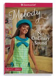
Even in the Beforever covers, you could see their full bodies so people can admire their period-appropriate outfits and glean a bit about the surroundings of the time like Maryellen’s cookie-cutter 50s suburbia and Melody’s covers are remiscent of Motown in the 60s plus her mini!
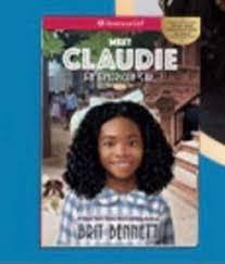
Cecila is just a headshot. She could be the Girl of the Year for all I know, the background is indistinct and, it’s just too too polished. None of the gritty, flashy busyness of 20s New York.
A good Harlem Renissance story would be American Girl’s History Mystery series- Mystery of the Dark Tower.
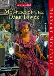
Look at the coche hat! And it has such prominant Harlem figures like A’leila Walker, and Langston Hughes. It has flappers, it has black Wall Street, it shows various African-American culture like voodoo, the more proper Christians from Barbados, etc. City life compared to rural and the rise of the black artistic movement. Now that’s the 20s!

Leave a comment