Ah yes, I have reached my 100th post (in 36 days no less)! I wrote this to almost catalogue all my favorite books over the years and to share thoughts and questions with fellow book lovers. Though I’m not sure how far reaching this (remember to comment so I know I’m not the only reading this thing), I’m posing another question that I always like to discuss with other book lovers.
New covers!
Now obviously new covers are issued because the book is popular so they insist on new editions with more fabulous art so on and etc. Other times I think it’s part of plot that they come out with new covers to trick people into buying a book they already have.
However, what I want to discuss is, if they’re making new book covers, why do they sometimes do it so badly?
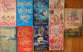
For example, the new covers for the Bridgerton series are wonderful. They have a vivid, eye catching color palette. They feature a glimpse of the swoon-worthy couples. It’s gorgeous and a bit more entertaining than a romantic dreamy shot of some ornamental items.

However, other new covers totally go against what they’re trying to represent. The new editions of Dear America are one particular that grinds my teeth.
Look at this original one, it looks like a girl that has eaten and trudged through the dust of the prarie, she’s tired and windblown but she’s very real and arresting as she looks you in the eye.

Now look at this airbrushed one! Now I know the original one is taken from an acutal picture while this is a phto-realistic painting but they could have at least made her look like she was dirtied and tired instead of a prarie wife waiting at the homefront. It gives no hint to the hardships that Hattie faces on the Oregon Trail.
Now look at Christmas After All


If we first ignore how Minnie looks a Sims character with such a blank face, the loss of the sepia tone makes the book’s character less real. For me at least. The sepia photo was part of the charm, that it felt like a real diary using the same techniques that would have been in used in the 30s.
Next is The Royal Diaries. Luckily they only did two before abandoning the practice.

First off by losing the gold lining and hardcover, it automatically feels less royal and less like a diary. Second off, with the small font for the title, I truly thought this was a totally different book before I actually looked into the contents to realize it was one and the same.
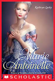
Look also at the Anastasia one.
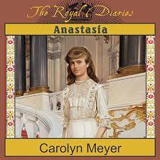
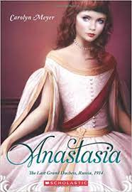
I chose a close up of the original so you can see the utmost detail and richness put into the original. You see the texture and thickness of the dress befitting the cold enviroment of Russia, you can see the lace decorating her front and the gilded decorations on the column behind her. In Marie Antoniette, you cannot see the cover here but if you had it in your hands you can see the flowers and birds decorating her wig. Basically it had detail to it, and emphasized the richness of the ladies. The new covers remind me of creepy porceline dolls.
I just don’t understand why they didn’t make art choices that would further emphasize the books gimmick of being historical diaries and instead of streamlined into something more generic. Okay, it’s probably generic in order to attract a wider audience but if they’re not into the content inside,t hey’re not going to buy it. And collectors of the series aren’t going t be willing to buy copies of the same book if they don’t like the art.
So what do you think? Is new art good or bad? If it ain’t broke, don’t do it? Or if they do it should it retain the same tone of the original?
Comment below!

Leave a comment